The opportunity
Their recent success in Australia led to new opportunities in the US market. Our role was to create a brand that enabled them to enter the new market with confidence and communicate their offering in a simple and engaging way.
The idea
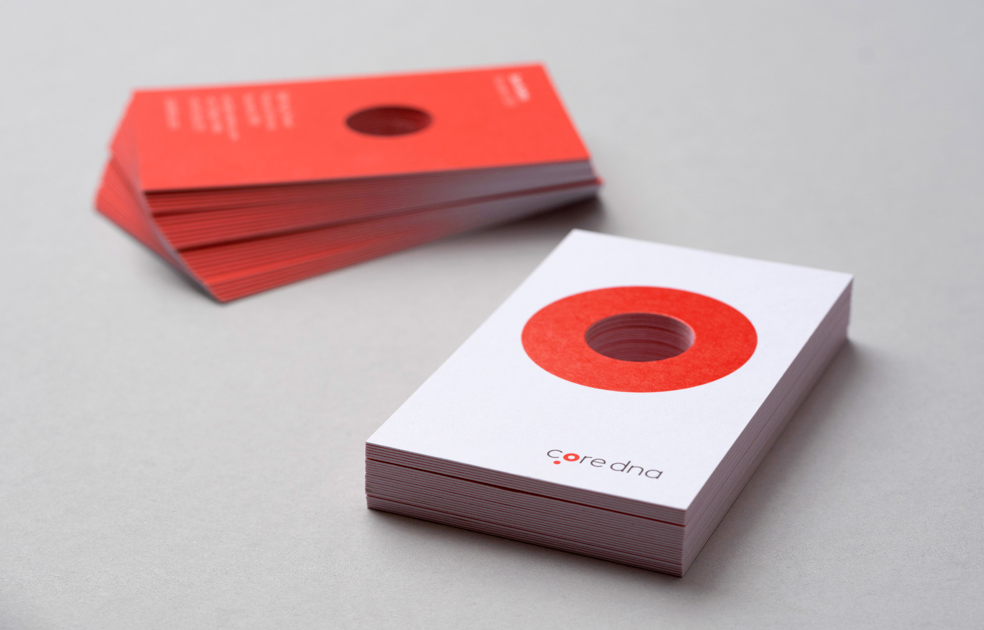
Thinking is at our core. We think big, and dream big. This is captured through the brandmark, which depicts the idea of thinking through its symbol.
The lowercase letters make it feel approachable, whilst its geometric forms ensure that the brandmark remains timeless and modern. The circle in the “o” represents the product offering – a total digital solution that is continuously evolving over time.


Creating a brand
Expert, helpful, friendly, innovative and uncomplicated. This is how we defined Core dna’s personality. The visual language utilises circular motifs throughout Core dna’s communications. They became an ownable element that allowed us to communicate key messages in a friendly and engaging way.
Our aim was to create a brand that highlighted the power of the product and empowered businesses to feel confident when choosing Core dna.